Analytics
This article refers to Platform v2.9.0. The current Platform version is v3.4.0.
Overview
The Analytics card on the Node Details page plots the historical evolution of telemetry — CPU, RAM, disk, temperature, system load, open files — over a time range you choose. Use it to spot trends, regressions, and the impact of a workload over time.
For the latest sample from a single point in time, read Telemetry.
Analytics card
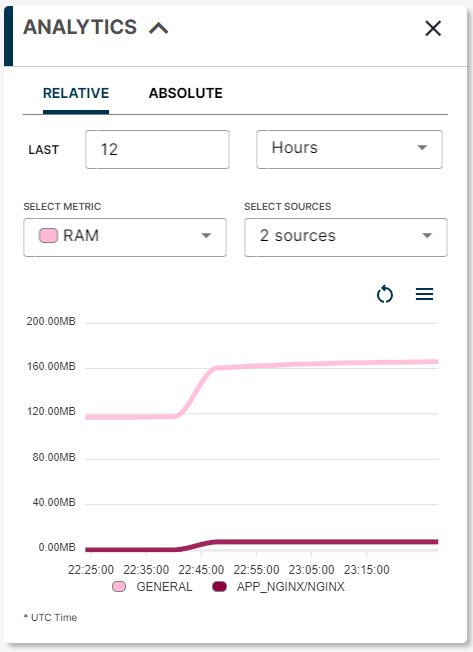
Analytics card
Building an analytics chart takes three inputs: a time period, a metric, and one or more datasources.
1. Time period
Pick the time range to plot.
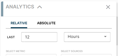
Time period selector
- Relative — a window that ends at now (for example, last 24 hours).
- Absolute — a fixed window between two specific timestamps.
If the node has not sent any telemetry within the selected window, the chart stays empty. Try a wider window or check that the node is online.
2. Metric
Choose which metric to plot:
- Temperature (node only)
- System Load (node only)
- RAM
- Disk
- CPU
- Files (processes only)
For a full description of every metric, read Telemetry.
3. Datasources
Once you have a metric, pick the datasources — the node itself and any process running on it. You can plot several datasources in the same chart for direct comparison.
Two situations leave the datasource selector empty:
- There is no data for the chosen metric in the chosen time window.
- There is no workload running that exposes the chosen metric.
Once the three inputs are set, the chart renders below.
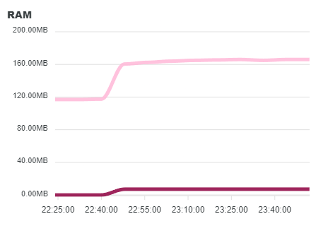
RAM evolution chart for a node
Export the chart
The menu in the top-left of the chart lets you download what you see in three formats:
- PNG image
- SVG vector image
- CSV data
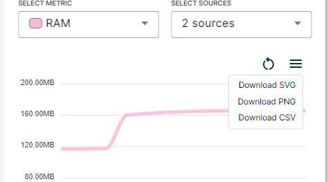
Export chart options
Summary
Pick a time period, a metric, and one or more datasources, and the Analytics card renders the evolution of a node or its processes over time. Export the chart as PNG, SVG, or CSV when you need to share it.